Lyric
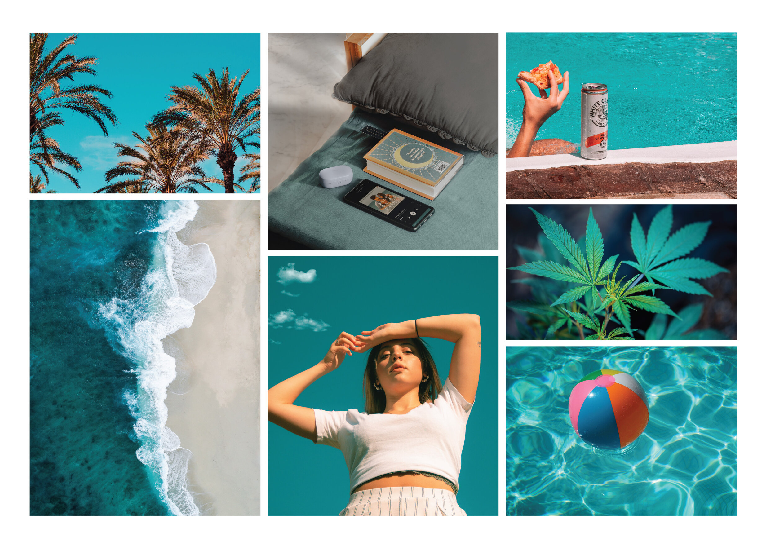
Branding & Identity | Packaging DesignLyric is a brand that produces a line of products derived from CBD. They aim to emphasise the recreational function of their products, and position the brand as a companion to one's leisure activities. Lyric will allow you to live in the now and enjoy every moment better.
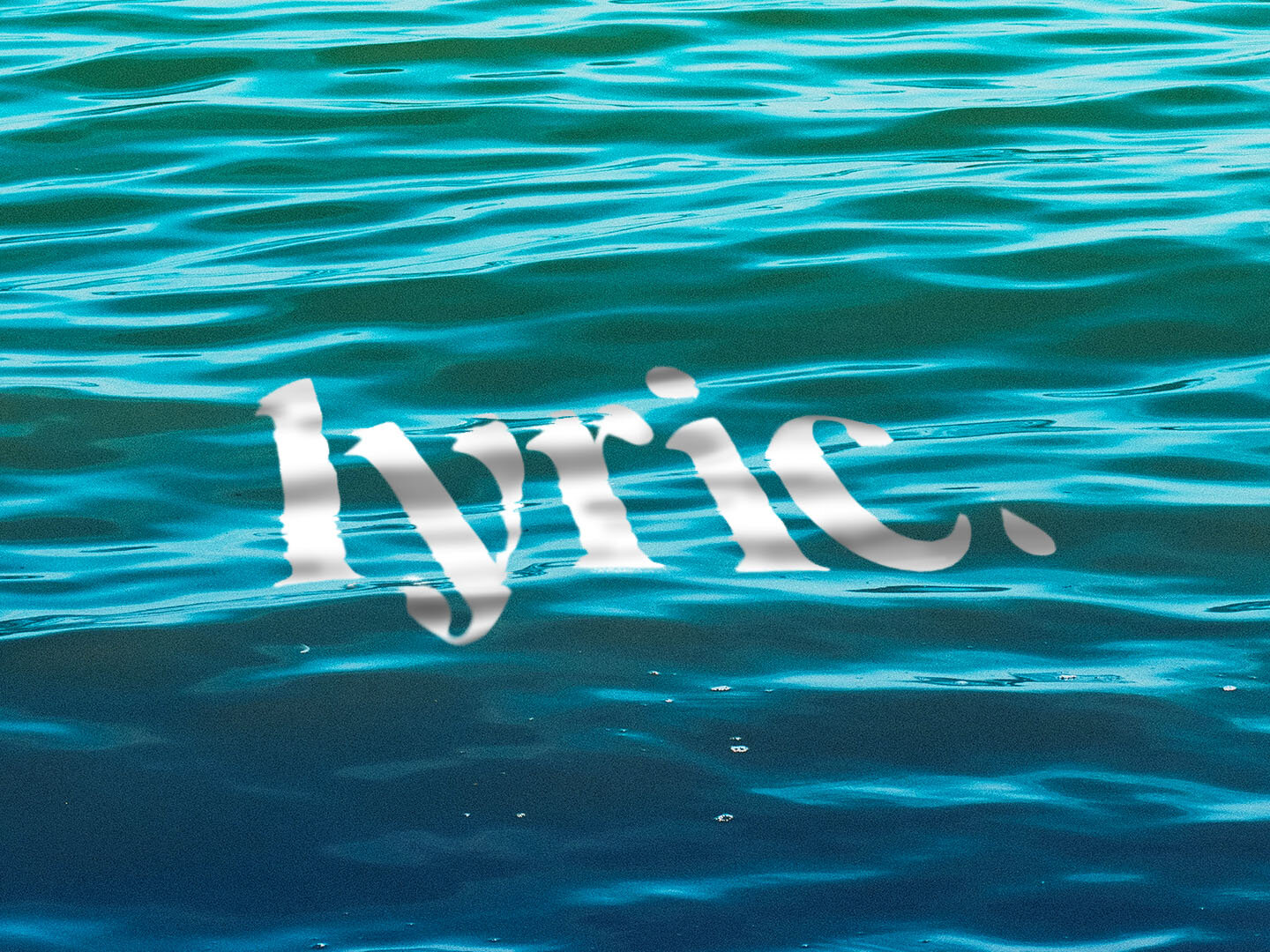
The brand is represented by an elegant serif logotype punctuated by a drop symbol, an ode to the oil dropper which is one of their main products.
Drawing inspiration from relaxing vibes of being by the beach and the sea, a wavy pattern was created as the key visual of the brand. It aims to say that Lyric helps you to unwind and loosen up. This pattern was applied as the primary graphic element of their packaging materials.